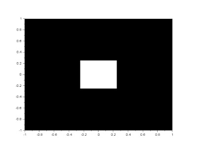
Using the code in the handouts given by Mam Jing, we are able to construct a circular aperture of desired radius. The code with some of my comments, and the figure are as follows.
Scilab code:
//This part describes the grid to be manipulated on the next part.
nx = 100; ny = 100; //defines the number of elements along x and y
x = linspace(-1,1,nx); //defines the range
y = linspace(-1,1,ny);
[X,Y] = ndgrid(x,y); //creates two 2-D arrays of x and y coordinates
//This part describes the synthetic image to be constructed
r= sqrt(X.^2 + Y.^2); //note element-per-element squaring of X and Y
A = zeros (nx,ny);
A (find(r<0.3) ) = 1; //desired radius is 0.3
f = scf();
grayplot(x,y,A);
f.color_map = graycolormap(32);
Figure 1. Circular aperture generated by the given code
Next, is my turn to create synthetic images. This is in order according to the handouts. Also, the same grid from the first code is used for all the following images. I just changed the description part of the code.
a) Centered square aperture
Figure 2. Centered square aperture generated by the following code
// Centered Square
A = zeros(nx,ny);
r= (abs(X+Y) + abs(X-Y));
A (find(r<0.5) ) = 1;
f = scf();
grayplot(x,y,A);
f.color_map = graycolormap(32);
It took me sometime to understand how the basic operation were done on the grid because I am not yet so familiar with scilab. Thanks to my seatmate Shua, I was able to understand how it was applied.
b) Sinusoid along the x direction (corrugated roof)
Figure 3. Corrugated roof generated by a sinusoid along x
//Sinusoid
A = zeros(nx,ny);
r = sin(X*10);
A (find(Y>r) ) = 1;
f = scf();
grayplot(x,y,A);
f.color_map = graycolormap(32);
I guess I didnt have much problem in this part. I just searched images on the web describing a corrugated roof.
c) Grating along x axis
Figure 4. Horizontal Grating
Figure 5. Vertical Grating
//Grating
r = sin(%pi*Y.*10); // I used Y for Figure for and X for Figure 5.
A = zeros (nx,ny);
A (find(r > 0.1)) = 1;
f = scf();
grayplot(x,y,A);
f.color_map = graycolormap(32);
The only problem is that i don't know what exactly does "grating along x axis" means. I searched the web for images, and it showed a lot of Figure 4, but majority of my classmates(who i ask) tell me its Figure 5.
d) Annulus
Figure 6. Annulus image
//Annulus
r = sqrt(X.^2 + Y.^2);
A = zeros(nx,ny);
A (find(r>0.3 & r<0.6)) = 1;
f = scf();
grayplot(x,y,A);
f.color_map = graycolormap(32);
In these part i discovered the boolean functions for scilab specifically the AND function denoted by the symbol &.
e) Circular aperture with graded transparency
Figure 7. Circular aperture with graded transparency
r = sqrt(X.^2 +Y.^2);
A = zeros(nx,ny);
g = exp(-2*r.^2); //gaussian function
A(find(r<0.5)) = 1;
B = g.*A; //element by element multiplication
f = scf();
grayplot(x,y,B);
f.color_map = graycolormap(32);
The circled part was easy to create, but the inner part took me a lot of time, Until i realize that i can create a gradient image using the gaussian function, and a circle aperture separately, and i just need to superimposed them. I did it using the element by element multiplication. Since the circle aperture consists of 0 outside, which will always be 0 for any given factor, and 1 inside. Multiplying the circle aperture image to the gaussian function will result to Figure 7 above.
Exploration
Figure 8. Subtraction of the X and Y values
f = scf();
grayplot(x,y,A);
f.color_map = graycolormap(32);
Figure 8. Addition of the X and Y values
A = X+Yf = scf();
grayplot(x,y,A);
f.color_map = graycolormap(32);
Figure 8. Division of the X and Y values
A = X/Y
f = scf();
grayplot(x,y,A);
f.color_map = graycolormap(32);
Figure 8. Multiplication of the X and Y values
A = X*Y
f = scf();
grayplot(x,y,A);
f.color_map = graycolormap(32);
Figure 8.Multiplication of X^2 and Y values
A = X*Y*X
f = scf();
grayplot(x,y,A);
f.color_map = graycolormap(32);
I think i produced all required outputs as well as the exploration part, and my images are good quality and with proper labels.
Self-evaluation grade : 10/10
I guess i cant give myself a bonus point since the exploration i did was only limited to what the manual said, which is applying basic operations on matrix and observing the formed images. Unlike my classmates which also explored 3D imaging.
Acknowledgements
Thanks to Shua, and ate Bastine for answering my questions about scilab and other things.


